
Colour Palettes That Make Cakes Look Pricier
Every baker in South Wales knows that a cake’s first impression matters just as much as its flavour. Whether you are preparing a birthday treat or an elegant wedding centrepiece, the colours and finishing touches sway how valuable your cake appears. Fortunately, you do not need pricey ingredients to create a professional look—understanding the power of a curated colour palette can make even simple cakes seem luxurious and special.
Table of Contents
- What Makes A Cake Look More Expensive
- Using Autumnal Tones And Neutrals Effectively
- Muted Brights Versus Vibrant Colours
- Incorporating Metallic Accents For Luxury
- Common Palette Mistakes Bakers Should Avoid
Key Takeaways
| Point | Details |
|---|---|
| Focus on Colour Palette | Use muted and sophisticated colours to signal luxury, avoiding vibrant shades that suggest budget cakes. |
| Incorporate Neutrals | Integrate neutral tones to enhance your colour scheme, providing structure and drawing attention to accents. |
| Limit Colour Variety | A controlled palette of three colours creates a more sophisticated appearance than multiple competing hues. |
| Strategic Use of Metallics | Apply metallic accents to enhance visual interest and perceived value without overwhelming the design. |
What Makes a Cake Look More Expensive
A cake’s perceived value comes down to three core elements: ingredient quality, visual sophistication, and craftsmanship. The good news? You don’t need to spend a fortune to master these techniques as an amateur baker in South Wales.
When customers see your cake, they’re making a snap judgment within seconds. They notice colour first, then texture, then overall finish. That’s where your colour palette becomes your secret weapon. The right colours instantly signal luxury, whilst ordinary colour choices can cheapen even a beautifully constructed cake.
The Psychology of Expensive-Looking Colours
Luxury cakes aren’t bright and cheerful—they’re sophisticated. Expensive cakes whisper rather than shout. This is the fundamental difference between a £25 cake and a £75 cake from a customer’s perspective.
Colours that evoke luxury share specific characteristics:
- Muted, refined tones rather than vibrant primaries
- Warm, earthy undertones that suggest natural ingredients
- Metallic accents that add opulence without overwhelming the design
- Neutral bases that let decorative details shine
Think about the expensive jewellery you’ve seen in Cardiff city centre shops. The displays don’t use neon. They use soft lighting, warm golds, deep burgundies, and creamy whites. Your cakes should feel the same way.
The colours you choose communicate value before your customer tastes a single crumb—choose wisely.
Why Autumn and Neutral Tones Win
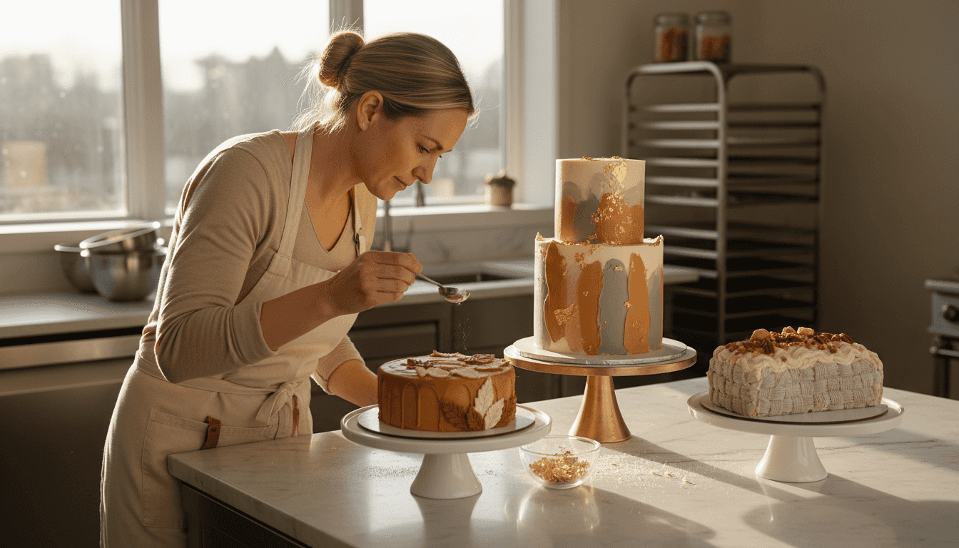
Autumn-leaning colour palettes feel inherently expensive because they suggest warmth, maturity, and natural beauty. Burnt sienna, terracotta, deep olive, sage green, and warm taupe feel collected rather than purchased off-the-shelf.
Neutrals aren’t boring—they’re the foundation of professional design. Cream, soft grey, warm beige, and ivory create a canvas where your decorative work becomes the focal point. This is the strategy luxury brands use globally.
Combining autumn tones with neutrals creates visual depth. A cake with a soft cream base, terracotta piping, and sage green accents feels curated rather than random.
Metallic Accents Transform Perception
Edible metallics are your shortcut to perceived luxury. Edible gold leaf and metallic accents elevate any colour scheme instantly. Gold suggests warmth and heritage; silver suggests contemporary elegance.
You don’t need to cover your entire cake in metallic. Strategic touches work best:
- Gold leaf on a sage green accent
- Silver dust along a muted burgundy stripe
- Copper accents on warm grey sections
- Pearl dust to highlight texture details
These touches take seconds to apply but create a premium visual impact that customers associate with professional bakeries.
The Power of Restraint
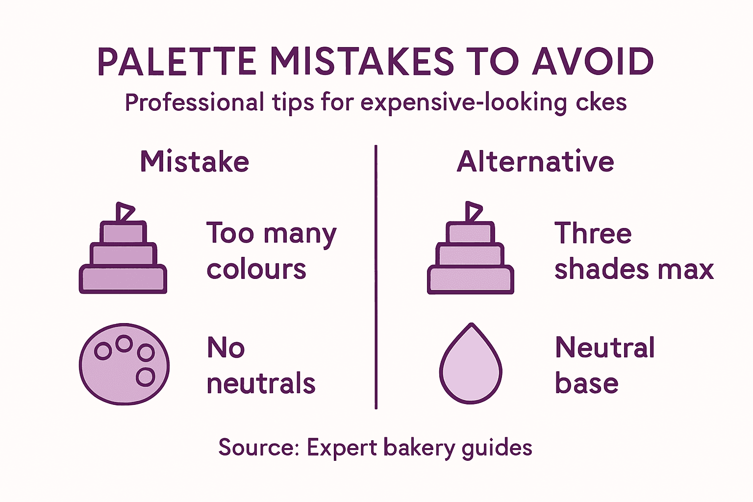
Expensive cakes use fewer colours, not more. A three-colour palette (one neutral base, one accent colour, one metallic) feels more controlled and sophisticated than six colours competing for attention.
When you’re planning your colour scheme, ask yourself: “Would this colour combination appear in a luxury hotel or high-end café?” If the answer is no, simplify it.
Amateur bakers often assume more colour equals more impressive. The opposite is true. Restraint screams professional confidence.
Pro tip: Start by choosing one muted autumn tone (such as dusty rose or warm bronze) as your main colour, a neutral (like soft cream) for your base, and let metallic accents handle the luxury element—this simple formula works for virtually any occasion.
Using Autumnal Tones and Neutrals Effectively
Autumnal tones are your secret weapon for making cakes look expensive. These colours naturally suggest warmth, maturity, and considered design—qualities associated with luxury. The trick is layering them strategically with neutrals to create visual sophistication rather than visual chaos.
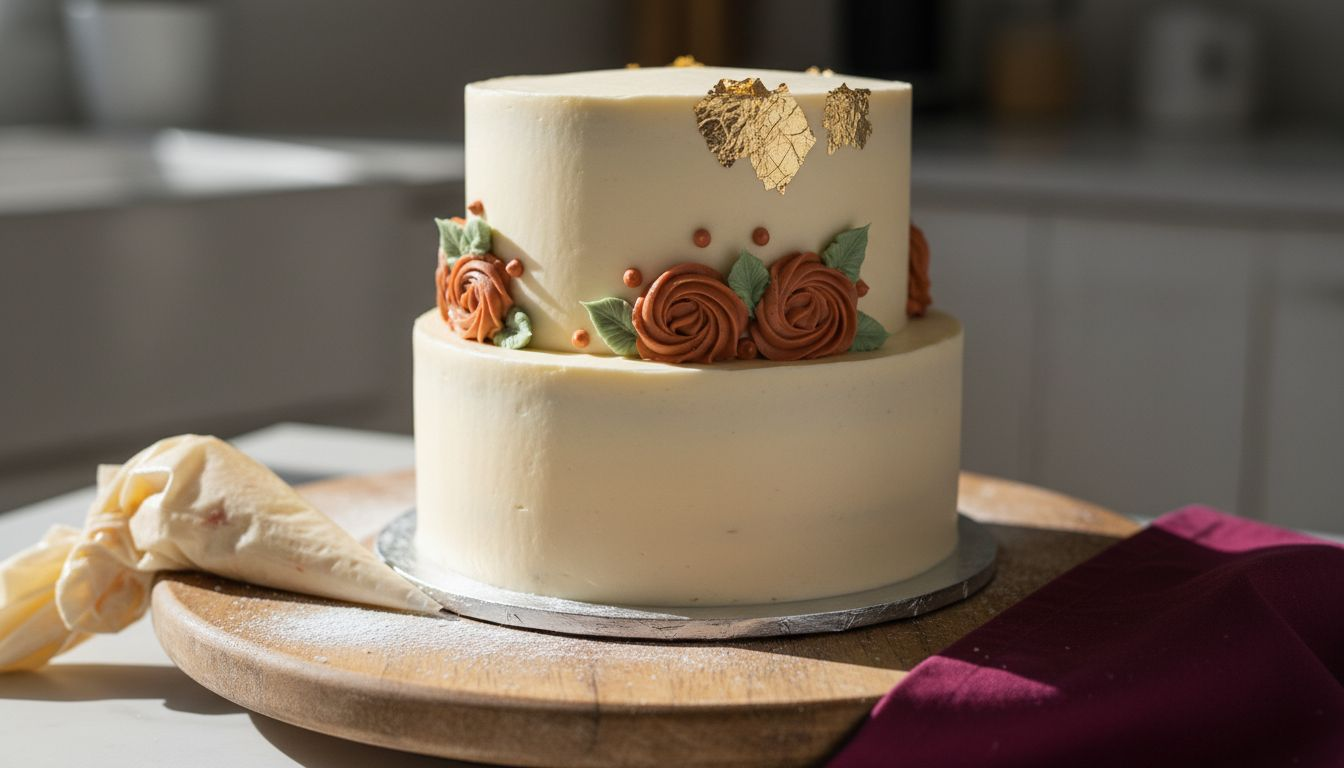
Start with your neutral base. Ivory, cream, or soft grey act as a canvas that lets your autumn accents shine. This foundation prevents your cake looking overwhelming. A neutral base communicates restraint and control, which are hallmarks of professional work.
Building Your Autumn Palette
Autumnal colours work best when you select a primary accent and support it with one secondary shade. This creates depth without looking chaotic.
Core autumn shades to consider:
- Burnt orange and rust for warmth and drama
- Deep burgundy and wine red for elegance and sophistication
- Golden amber and ochre for richness and luxury
- Sage green and deep olive for natural, earthy feel
- Toffee and caramel for soft, approachable warmth
Combine one of these with your neutral base. A cream cake with burnt orange piping feels intentional. A soft grey cake with deep burgundy accents feels contemporary and upmarket.
Layering seasonal colours creates visual interest without confusion. Think of your neutral base as the canvas, your primary autumn colour as the statement, and secondary shades as supporting details.
Autumn palettes succeed because they feel collected and intentional—never random or thrown together.
Adding Texture and Dimension
Colour alone isn’t enough. Texture makes cakes look expensive. Combine your autumn tones with visual depth through strategic placement and layering.
Consider these techniques:
- Use darker shades on lower tiers, lighter shades above (creates visual balance)
- Apply colour in bands or panels rather than all-over coverage
- Let your neutral base peek through your autumn accents
- Vary saturation levels (use one bold colour with one muted version)
This approach prevents your cake looking like a single flat colour block. Instead, it suggests careful planning and professional execution.
The Metallic Integration
Metallics belong in every autumn palette. Gold and copper enhance warm autumn tones perfectly. Silver works with cooler autumnal shades like deep burgundy.
Apply metallics strategically:
- Highlight edges between colour blocks
- Dust along textured areas like buttercream ridges
- Add small touches rather than full coverage
- Use metallic accents to draw attention to your best decorative work
This integration transforms your cake from nice to noticeably expensive.
Pro tip: Mix your autumn base colour with a touch of metallic dust (available from Vanilla Valley) before applying it to your cake—this creates a subtle shimmer that looks intentional and luxurious without obvious metallic coverage.
Muted Brights Versus Vibrant Colours
Here’s the uncomfortable truth: vibrant colours scream budget cake. Muted brights whisper premium. This single distinction separates cakes that look like they cost £30 from those that look like they cost £80.
Vibrant colours—hot pink, electric blue, neon yellow—demand attention. They’re playful and energetic. But they’re also what high-street bakeries use when they want volume over value. Your customers subconsciously associate these bright shades with mass production, not artisanal craftsmanship.
Muted brights work differently. Think dusty rose instead of hot pink. Sage instead of bright green. Warm terracotta instead of orange. These colours have sophistication built in.
Understanding Muted Versus Vibrant
Choosing between muted brights and vibrant colours depends on the impression you want to create. Muted brights signal elegance and intentionality. Vibrant colours signal fun and informality.
For cakes positioned as premium or luxury, muted brights work every single time. They suggest your customer paid for quality, not just sugar.
What makes a colour “muted”?
- Lower saturation (colour mixed with grey or white)
- Softer appearance (less intensity, more subtlety)
- Sophisticated feel (associated with high-end design)
- Timeless quality (trends matter less with muted tones)
When you reduce a colour’s brightness and saturation slightly, it automatically feels more expensive. This isn’t opinion—it’s how human perception works. Luxury brands know this.
Here is a comparison of muted brights and vibrant colours and their effect on cake perception:
| Colour Type | Associated Impression | Suitable Occasions | Pairs Well With |
|---|---|---|---|
| Muted Brights | Elegant and intentional | Weddings, luxury events | Metallics, neutrals |
| Vibrant Colours | Playful and informal | Children’s parties, casual | Sprinkles, simple décor |
Muted brights look collected and considered. Vibrant colours look like they were chosen on impulse.
Practical Application for Your Cakes
If a client wants “pink,” offer dusty rose or mauve instead. If they ask for “blue,” suggest soft slate or powder blue. If they mention “green,” propose sage or celadon.
Frame these suggestions as premium options:
- Dusty rose photographs beautifully
- Sage green pairs perfectly with metallics
- Powder blue feels contemporary and expensive
- Soft grey creates a luxury canvas
- Muted burgundy suggests sophistication
Most amateur bakers in South Wales default to vibrant colours because they’re easier to mix and more obviously “there.” Muted versions require slightly more pigment control, but the payoff is massive in perceived value.
When Vibrant Works
Vibrant colours aren’t forbidden—they’re just strategic choices. Use them sparingly as accents rather than as your main palette. A muted cream cake with a small vibrant accent detail (like a bright pink sugar flower) works brilliantly.
This creates visual interest without looking cheap. It says your main design is sophisticated, with playful details added intentionally.
Pro tip: When clients ask for bright colours, mix the pigment with white buttercream gradually until you reach a muted version, then show them both options side by side—nine times out of ten, they’ll choose the muted version once they see how much more expensive it looks.
Incorporating Metallic Accents for Luxury
Metallics are the fastest route to perceived luxury. A simple cake becomes expensive-looking the moment you add gold leaf or silver dust. This isn’t subtle—it’s transformative. Your customers instantly recognise metallics as a premium choice.
The key is strategic placement. Metallics work best as accents, not as the main event. A cake that’s entirely gold leaf looks costume-like. A cake with gold leaf highlighting specific details looks intentional and refined.
Think of metallics as your final edit. Once your colour palette and design are complete, metallics amplify the impression of quality without changing the fundamental design.
Types of Metallic Finishes
Metallic accents such as gold leaf and silver dust add luxurious dimension to cakes. Each metallic type creates different effects and works with different colour palettes.
Your metallic options include:
- Edible gold leaf for warm, classic luxury (works with autumn tones, cream, burgundy)
- Silver dust for contemporary, cool elegance (pairs with grey, soft blue, deep jewel tones)
- Rose gold for modern, softer luxury (flatters dusty pink, peach, warm neutrals)
- Copper for warm richness (enhances orange, brown, terracotta)
- Pearl dust for subtle shimmer (works with any colour without dominating)
Choose your metallic based on your colour palette. Gold naturally complements warm autumn tones. Silver suits cool, contemporary palettes. Rose gold bridges warm and cool beautifully.
Strategic Placement Techniques
Where you place your metallic matters as much as which metallic you choose. Placement communicates intentionality.
Effective placement options:
- Edge highlighting (dust along buttercream ridges or fondant seams)
- Border detail (thin metallic line between colour blocks)
- Flower accenting (dust on sugar flowers or floral toppers)
- Textured surface dusting (apply to ruffles or piped details)
- Geometric patterns (use stencils for precise, sophisticated placement)
Avoid covering large flat areas entirely. Instead, use metallics to draw attention to your best decorative work. If you’ve piped beautiful details, highlight them with metallic dust. This creates focal points and suggests professional planning.
Metallics whisper sophistication when placed strategically. They shout cheapness when overused.
Practical Application Tips
Applying metallic successfully requires the right technique. Dry dust (like pearl or copper dust) applies directly to dry fondant or buttercream using a soft brush. Leaf (gold or silver sheets) requires edible glue or a slightly damp brush for adhesion.
Start small. A light dusting looks more expensive than heavy coverage. You can always add more. Removing excess is difficult.
Metallics photograph beautifully under natural light, which makes your cakes look even more luxurious in customer photos and social media posts.
Pro tip: Keep edible gold leaf and pearl dust from Vanilla Valley in your decorating kit at all times—they transform ordinary designs into premium-looking cakes instantly, and a little goes a very long way.
Common Palette Mistakes Bakers Should Avoid
Most amateur bakers make the same colour mistakes repeatedly. These aren’t small issues—they directly damage perceived value. Understanding what goes wrong helps you avoid the traps that cheapen your work.
The good news? These mistakes are completely preventable once you know what to watch for. Many of the errors stem from intuition rather than strategy. Your instincts want to add more colour. Professional design says remove it.
Let’s walk through the pitfalls that consistently undermine even well-constructed cakes.
Too Many Colours Competing for Attention
This is the number one mistake. Bakers think variety equals visual interest. It doesn’t. It equals chaos.
A cake with six different colours looks chaotic and indecisive. A cake with three carefully chosen colours looks intentional and curated. Avoiding disjointed colour palettes requires restraint and planning.
When you’re tempted to add another colour, ask yourself: “Does this colour serve a purpose, or am I adding it because I have it?” If the answer is the latter, stop.
Common colour overload scenarios:
- Rainbow sprinkles on an otherwise sophisticated cake
- Piping in five different colours when three would do
- Mixing warm and cool tones without a neutral bridge
- Adding accent colours without removing base colours
Each additional colour dilutes the impact of your palette. Less is always more with luxury.
Five colours make a cake look like a birthday party favour. Three colours make it look like it cost £200.
Ignoring Neutrals
Neutrals aren’t filler. They’re structure. Many bakers treat neutrals as boring and skip them entirely. This creates flat, one-dimensional designs.
Without a neutral base or bridge, even beautiful colours feel jarring. Neutrals create breathing room. They let your accent colours shine rather than compete.
A palette missing neutrals feels amateur. A palette built on neutrals with strategic accents feels professional.
Clashing Warm and Cool Tones
Mixing warm autumn tones with cool blues or purples without a bridge creates visual discord. Your eye doesn’t know where to rest.
If you’re using both warm and cool colours, use a neutral (grey, white, or beige) as a transition zone. This prevents jarring colour combinations.
Not Testing Colours First
Mixing colour in a tiny bowl and assuming it’ll look right on a full cake is a mistake. Colours shift when applied to large areas. What looks perfect in small quantities can become overpowering on an entire tier.
Always test on a practice cake or cardboard. See how your colours interact at full scale before committing to the final cake.
Forgetting Event Context
A bright, playful palette works for children’s parties. It looks wrong for a luxury wedding cake. Matching your palette to the event’s tone is essential.
Understanding your client’s vision prevents misaligned colour choices that undermine perceived value.
Pro tip: Before finalising any palette, create a small mock-up cake or sketch using your chosen colours, then photograph it in the same lighting conditions where the final cake will be displayed—this reveals colour issues before they affect your customer’s perception.
Common palette mistakes and their professional alternatives are summarised below:
| Common Mistake | Why It Fails | Professional Alternative |
|---|---|---|
| Too many colours | Looks chaotic | Use a controlled three-colour scheme |
| Ignoring neutrals | Creates visual dissonance | Integrate creams, greys, or beiges |
| Clashing warm and cool tones | Causes discomfort | Bridge with a soft neutral |
| Not testing colours first | Surprises on final cake | Test colours on a mock-up |
| Never considering event context | Palette feels mismatched | Adapt colours to the celebration type |
Elevate Your Cake Designs with Expert Colour Palettes and Premium Supplies
Struggling to make your cakes look more luxurious without overspending? The key lies in mastering muted autumn tones, neutrals, and metallic accents just like the article reveals. At The Vanilla Valley, we understand how crucial the right colour combinations and quality supplies are for transforming amateur efforts into professional masterpieces. Our extensive range of food colours, edible metallics, and decorating accessories helps you achieve the sophisticated palettes and textures that make every cake appear pricier and more refined.
Discover how our trusted products and expert guidance can support your cake decorating journey today. Whether you want to test subtle hues or add those flawless gold leaf touches, start with high-quality food colours and metallic accents from The Vanilla Valley. Join countless bakers who rely on our years of experience and loyalty benefits to create cakes that captivate and command premium prices. Visit our online store now and take the first step towards designing cakes that truly reflect your skill and passion.
Frequently Asked Questions
How can I choose a colour palette that makes my cakes look more expensive?
To create a luxurious look, opt for a three-colour palette featuring a neutral base, one muted autumn shade, and a metallic accent. This combination suggests sophistication and intentionality.
What types of colours should I avoid to ensure my cake looks high-end?
Avoid vibrant primary colours and opt for muted brights instead. Bright colours can communicate a budget aesthetic, while softer, muted tones suggest quality and elegance.
How do metallic accents enhance the appearance of my cake?
Metallic accents, such as gold or silver, add a touch of luxury and sophistication. Use these strategically as highlights rather than covering large areas to maintain an elegant look.
Why are autumnal tones effective in cake design?
Autumnal tones evoke warmth, maturity, and natural beauty. When layered with neutrals, they create visual depth and suggest a carefully curated design, which is often associated with premium quality.