
Gorgeous pastel wedding cake colour combinations
Selecting pastel wedding cake colours that stand out and photograph beautifully is a genuine challenge. Pastel tones offer elegance, versatility, and timeless appeal for weddings, but they can appear dull in low light or fail to pop in photographs. This article provides creative combinations, expert presentation tips, and details on pairing pastels with decorations for unforgettable cakes. You’ll discover how to choose colours that complement your venue, enhance your theme, and create a cake that guests will remember long after the last slice is served.
Table of Contents
- What to consider when choosing pastel cake colours
- Top pastel wedding cake colour combinations
- How to pair pastel cakes with metallics and bold accents
- Easy techniques for achieving perfect pastel shades
- Pastel cake palette comparison table
- Bring your pastel wedding cake vision to life
- Frequently asked questions
Key Takeaways
| Point | Details |
|---|---|
| Match pastels with wedding style | Choose pastel colours that reflect the couple’s floral and overall wedding theme. |
| Enhance with metallics | Add gold or silver to pastel cakes for extra impact and better photos. |
| Mix pastel shades carefully | Use gel colourings and test small batches to achieve the best results. |
| Use the comparison table | Refer to the table to find a pastel palette that fits your venue and decor vibe. |
What to consider when choosing pastel cake colours
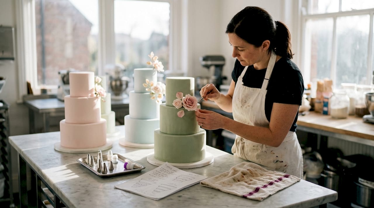
With the unique challenges of pastels in mind, let’s clarify what you should consider before picking your cake’s palette. Lighting, venue decor, and photography can dramatically affect how pastels appear. A blush pink that looks romantic in natural daylight might wash out under tungsten bulbs or appear flat in evening photographs. Pairing with metallic touches, like gold leaf or edible pearls, enhances the visual impact and prevents your cake from disappearing into the background.
Aligning with floral schemes or invitations ensures a cohesive event style. Match your cake palette to wedding florals for a harmonious look that ties every element together. Consider cake type, filling colours, and display setting for best results. A naked cake with visible sponge layers might benefit from bolder pastel buttercream, whilst a fully covered fondant cake can carry softer shades beautifully.
Pro Tip: Layered pastel cakes can create a dreamy ombre effect that photographs stunningly and adds visual interest without overwhelming your colour scheme.
When planning your palette, think about these essential factors:
- Venue lighting conditions and time of day for photographs
- Existing decor colours and floral arrangements
- Season and overall wedding theme
- Cake structure and decorating techniques you’ll use
- How colours will appear against your cake stand or display backdrop
Exploring colour palettes in cake decorating helps you understand which combinations work harmoniously together. You can also learn techniques to make cakes look pricier through strategic colour choices that elevate perceived value.
“The right pastel combination transforms a simple cake into a showstopping centrepiece that reflects your personality and wedding vision.”
Top pastel wedding cake colour combinations
Now that you know what factors matter, explore our top recommended pastel combinations that will elevate any wedding cake. These pairings have been chosen for their visual appeal, versatility, and proven success at real weddings.
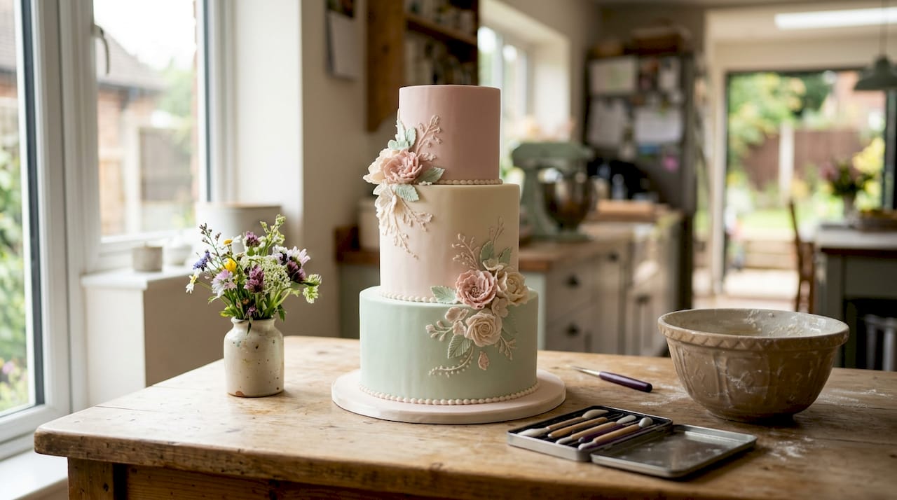
Blush pink, ivory, and mint create a romantic and ultra-modern aesthetic. This trio works beautifully for spring and summer weddings, offering softness with just enough contrast to prevent the cake from looking washed out. The mint adds a fresh, contemporary edge that keeps the palette from feeling too traditional.
Lilac, baby blue, and peach deliver whimsical and playful pairings perfect for couples wanting something unique. This combination photographs exceptionally well and suits garden weddings or venues with natural light. The warmth of peach balances the cooler tones beautifully.
Lemon yellow and soft grey bring contemporary elegance to any celebration. This unexpected pairing feels sophisticated and modern, ideal for urban venues or couples who want to avoid traditional pink tones. The grey grounds the brightness of yellow without making it feel childish.
Pistachio, peach, and blush are perfect for summer and outdoor events. Spring wedding cake trends highlight these nature-inspired shades as standout options. The green adds an organic feel whilst the warm tones create depth and richness.
Periwinkle and pastel coral offer lively and unique options, great for adventurous couples. This bold combination stands out in photographs and works particularly well with metallic gold accents. It’s fresh, unexpected, and absolutely stunning when executed properly.
| Colour Combination | Best Season | Mood | Metallic Pairing |
|---|---|---|---|
| Blush, ivory, mint | Spring/Summer | Romantic, fresh | Gold or rose gold |
| Lilac, baby blue, peach | Spring | Whimsical, playful | Silver |
| Lemon, soft grey | Year-round | Modern, sophisticated | Silver or platinum |
| Pistachio, peach, blush | Summer/Autumn | Natural, warm | Gold |
| Periwinkle, pastel coral | Summer | Bold, unique | Gold |
These combinations work because they balance warm and cool tones, provide enough contrast for visual interest, and photograph beautifully in various lighting conditions. Each palette can be adjusted in intensity depending on your personal preferences and venue requirements.
How to pair pastel cakes with metallics and bold accents
After picking your combination, it’s time to amplify the effect with clever accenting. Adding metallic elements brings pops of glamour and prevents pastels from appearing dull in low-light venues. The key is using metallics strategically rather than overwhelming your delicate colour palette.
Best ways to highlight pastels include:
- Gold leaf edges that catch light and create dimension
- Edible pearls clustered at tier bases or cascading down sides
- Textured piping in complementary metallic shades
- Delicate metallic stencilling or hand-painted details
How different metallics complement pastel cakes depends on your colour choices. Gold works beautifully with warm pastels like peach, blush, and lemon, creating a luxurious feel. Silver pairs perfectly with cooler tones such as lilac, mint, and baby blue, offering a crisp, elegant contrast. Rose gold bridges the gap, working with nearly any pastel combination whilst adding a romantic, contemporary touch.
Coordinating fresh or sugar flowers with pastel palettes creates balance and prevents your cake from looking flat. Choose blooms that either match your pastel shades exactly or provide gentle contrast. White flowers with pastel centres work wonderfully, as do deeper jewel tones used sparingly for dramatic effect.
Pro Tip: Small metallic touches can photograph powerfully, so you don’t need extensive coverage. A few strategic placements create maximum impact without overwhelming your pastel palette.
Exploring techniques for using colour dusts helps you add subtle shimmer that enhances pastels without changing their base colour. You can also incorporate these ideas into broader dessert table concepts for a cohesive presentation.
“Metallics act as jewellery for your cake, adding sparkle and sophistication that makes pastels shine rather than fade into the background.”
Easy techniques for achieving perfect pastel shades
Of course, a stunning palette is only possible when your colours are precise. Not all food colourings behave the same when blended for pastels. Colour gels yield consistent results, but powder dusts add subtle shimmer that can elevate your finish.
Follow these steps for tinting buttercream:
- Start with pure white buttercream at room temperature for accurate colour assessment
- Add gel colour one drop at a time using a cocktail stick, not directly from the bottle
- Mix thoroughly and allow the colour to develop for 5-10 minutes before adding more
- Remember that buttercream darkens slightly as it sets, so aim slightly lighter than your target shade
- Keep notes on exact drop counts so you can replicate colours across multiple batches
For fondant and modelling paste, the process differs slightly. Knead gel colour into small portions first, then incorporate these coloured pieces into your larger batch. This prevents streaking and ensures even distribution. Work the fondant until no marbling remains and the colour is completely uniform.
Pro Tip: Always mix a test batch first to preview your final shade. Pastels are unforgiving, and it’s far easier to adjust a small sample than to correct an entire batch of buttercream or fondant.
Balance pigment drops to avoid oversaturating when aiming for pastels. The difference between perfect pastel and overly bright can be a single drop of colour. If you accidentally add too much, you can lighten the shade by mixing in additional white buttercream or fondant, though this increases your total quantity.
Learning proper methods for colouring sugarpaste ensures smooth, even results. You’ll also benefit from understanding how to colour buttercream without changing texture, which is crucial for maintaining pipeable consistency. For decorative elements, explore painting tips for modelling paste to add detailed accents.
Pastel cake palette comparison table
With inspiration in mind, use this handy table to compare each combination for your needs. This reference helps you quickly shortlist your favourite palettes based on specific criteria that matter most for your wedding vision.
| Palette | Romantic Appeal | Versatility | Trend Factor | Best Metallic | Floral Compatibility |
|---|---|---|---|---|---|
| Blush, ivory, mint | Very high | High | Classic | Gold/rose gold | Roses, peonies, eucalyptus |
| Lilac, baby blue, peach | High | Medium | Trending | Silver | Hydrangeas, sweet peas |
| Lemon, soft grey | Medium | Very high | Modern | Silver/platinum | White blooms, greenery |
| Pistachio, peach, blush | High | Medium | Rising | Gold | Garden roses, ranunculus |
| Periwinkle, coral | Medium | Medium | Unique | Gold | Dahlias, anemones |
This comparison reveals that blush, ivory, and mint offers the highest overall versatility whilst maintaining strong romantic appeal. However, if you’re seeking something truly unique that will stand out in wedding photographs, periwinkle and coral provides that distinctive edge. Lemon and grey scores highest for versatility, adapting beautifully to any season or venue style.
Consider your priorities when making your final selection. Romantic appeal matters most for traditional ceremonies, whilst trend factor might be important if you want your cake to feel current and Instagram-worthy. Versatility becomes crucial if you’re planning a wedding with multiple events or uncertain weather conditions that might require venue changes.
Bring your pastel wedding cake vision to life
Creating a stunning pastel wedding cake starts with having the right supplies and expert guidance at your fingertips. At The Vanilla Valley, we’ve been supporting bakers since 2009 with everything needed to transform colour inspiration into edible masterpieces. Whether you’re working with buttercream, fondant, or modelling paste, our range of professional food colours delivers the precise pastel shades you envision.
Our collection includes gel colours perfect for achieving those delicate pastel tones, alongside edible dusts and metallic accents that bring your colour combinations to life. We stock trusted brands and offer expert advice through our blog articles, helping you master techniques from basic colour mixing to advanced decoration methods. With free delivery options and our customer loyalty club, we make it easy to gather everything you need for your wedding cake project. Visit our North Cardiff storefront or shop online to discover the quality supplies that professional and home bakers trust for their most important celebrations.
Frequently asked questions
Which pastel colours last longest on cakes?
Gel-based pastels are most fade-resistant under display lights and in photographs. Certain food colourings yield more vibrant results than others and are ideal for wedding display cakes.
How can I stop pastel cakes from looking washed out in wedding photographs?
Add subtle metallics or bold flowers to help pastel cakes stand out in photos, especially in venues with soft lighting. Metallic details bring visual interest and keep pastels looking bright in images.
What flavours work best with pastel wedding cakes?
Vanilla, lemon, almond, or rose are popular as they complement pastel colours without overpowering. These delicate flavours match the soft visual aesthetic whilst offering sophisticated taste profiles.
Are pastel palettes suitable for all wedding themes?
Yes, pastels adapt well to romantic, rustic, boho, and modern weddings when paired thoughtfully with flowers and decor. Their versatility makes them a safe yet stunning choice.
How many pastel colours should I use on one wedding cake?
Two to three pastel shades create the most balanced and sophisticated look. More colours can appear busy, whilst a single pastel might lack visual interest and depth.
Recommended
- Spring wedding cake trends 2026 UK: standout styles - The Vanilla Valley
- Creative wedding dessert table ideas for spring 2026 - The Vanilla Valley
- How to Colour Sugarpaste for Stunning Cake Designs - The Vanilla Valley
- Buttercream vs fondant wedding cakes: pros and cons - The Vanilla Valley
- 7 Creative Wedding Decor Ideas: Champagne Tower & More